Small Tweaks, Big Impact: Updating Paul Brice’s Brand
- Sep 3, 2025
- 3 min read
A Fresh Look
We recently worked with Paul Brice (www.paulbrice.exp.uk.com), a local East Grinstead estate agent, to refine and strengthen his brand identity across print and digital platforms. Paul already had a clear voice and a great client-facing attitude. We simply helped bring that personality into his visuals. The goal was to make sure his brand communicated who he is and what he does, clearly and consistently.
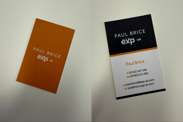
We started with his business cards. They had a strong layout, but one small detail was missing: his job title. We updated the design to include Estate Agent, so there’s no room for confusion. A quick, subtle fix that makes a real difference in first impressions. Next, we looked at his email header and supporting visuals. We refreshed the overall design, ensuring that colours, fonts and layouts worked together across all platforms. The new visuals are more aligned with Paul’s professional yet approachable tone. They feel modern, polished and considered without losing the personal touch that makes Paul’s brand stand out.
Rather than reinventing the wheel, we focused on tightening the brand. We kept what worked and improved what could be clearer. The result is a stronger identity that looks great, feels consistent and supports Paul’s business as it grows.

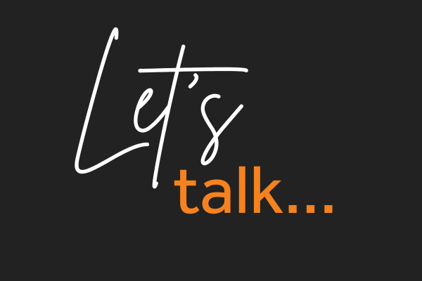
Using Script Fonts with Purpose
Paul’s catchphrase, "Let’s talk", plays a central role in his brand. It’s warm, inviting and simple. But how it appears visually is just as important as the words themselves. Originally, the entire phrase was styled in a handwritten script font. While it added personality, it wasn’t always easy to read, especially on smaller formats like mobile or business cards.
Script fonts can work well when used with care. They add flair and a human touch, but they’re not always suited to long phrases or small sizes. If readability suffers, the message can be lost. That’s why it’s important to use script fonts sparingly and with purpose.
There’s also the question of accessibility. Not everyone finds script fonts easy to read. People with dyslexia, visual impairments or reading difficulties can struggle with decorative styles. Clear, legible typography is essential if you want your message to be inclusive and effective for a wider audience.
In design, legibility should always come first. Your message needs to be understood instantly, not second-guessed. Fonts should support your message, not compete with it.
How did we overcome this?
We didn’t want to lose the charm of Paul’s catchphrase, so we refined it.
We kept “Let’s” in a flowing script font to maintain its warmth and friendly tone. To bring clarity, we styled “Talk” in a bold serif font. This simple combination strikes the right balance. The phrase is still personal, but now it’s clear and easy to read wherever it appears.
This small design decision had a big impact. It now works across email banners, business cards and social media without losing its meaning or style.
A Brand That Works Everywhere
Following the refresh, Paul’s brand now feels aligned across all touchpoints.
His new business cards are clear and confident. The refreshed layout highlights his role as an estate agent and presents his details in a clean, well-structured format. The new "Let’s talk" treatment stands out for the right reasons and adds personality without compromising clarity.
His email header has also been updated to match the new visual direction. Colours, fonts and messaging now work together across platforms, giving a joined-up feel that builds trust and professionalism.
We also created assets designed for social media. These carry the same look and feel, making Paul’s brand recognisable whether viewed on a screen or in print.
This refresh wasn’t about starting over. It was about creating a brand that’s smart, confident and ready to grow with the business. And now, Paul’s brand speaks with clarity, consistency and purpose.